

Why the Cover Is the First Chapter
Before a reader turns a single page, the cover has already done a great deal of work. It has told them whether they are holding a sprawling space opera or an intimate, magic-tinged mystery. It has signalled the mood, the scale and often the central tension of the story. For science fiction and fantasy, where the reader must accept an unfamiliar world without hesitation, that visual shorthand matters more than in almost any other genre. We spoke to a handful of cover artists working across the UK about how they build worlds in a single image — and what they want authors to understand about the process.
Colour Sets the Rules of the World
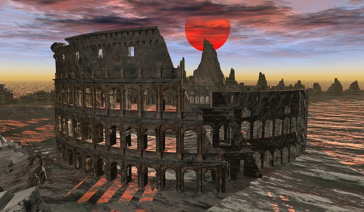
Colour is the fastest tool an artist has. Long before a reader registers a spaceship or a sword, they register a palette, and that palette tells them what kind of story they are about to enter.
"Warm golds and deep reds read as epic and mythic," one illustrator explains. "Cool blues and desaturated greens read as clinical, lonely or uneasy. If you mix the two, you are already promising a collision — an old world meeting a new one, or a character caught between them."
Practical choices follow from that. A book about a decaying empire might lean on rust, ochre and bruised purple, avoiding the clean silver that would suggest optimism. A story set aboard a generation ship often uses a narrow, claustrophobic range punctuated by one assertive accent colour — the single red warning light, the one green plant. That accent becomes the visual equivalent of the novel's central conflict.
Artists are also deliberate about temperature. If the protagonist's journey moves from safety to danger, the cover may place a warm foreground against a cold background, so the eye feels the shift before the brain names it.
Composition Tells You Where to Look — and What to Fear
Composition is worldbuilding disguised as layout. Where the artist places the figure, the horizon and the light source all carry meaning.
- A small figure, vast landscape. Signals awe, isolation or a world that dwarfs human concerns.
- A centred, symmetrical figure. Suggests control, destiny or a protagonist who believes they understand the rules.
- A figure at the edge, looking in. Promises an outsider's story, or a threshold about to be crossed.
- A tilted horizon. Instils unease without the reader knowing exactly why.
"I always ask where the tension lives," says another artist. "If the conflict is internal, the figure often faces away from the viewer, or is partly hidden by architecture. If it is external, I put the threat in the composition — a shape on the horizon, a shadow that does not match its owner."
Negative space is used just as carefully. A cover that leaves a third of the image empty is not being lazy; it is giving the reader room to feel the emptiness of the world itself.
The Hidden Symbols Readers Find on the Second Look
The best covers reward attention. Artists frequently bury motifs that only make sense once the book has been read, and they do it because the reread matters.
Common hiding places include:
- Repeated geometry. A rune, a fracture pattern or a constellation that mirrors the plot's structure.
- Background figures. Silhouettes that turn out to be characters who appear much later in the series.
- Object foreshadowing. A key, a ring or a weapon shown half-hidden, whose significance is not obvious on a first glance.
- Colour echoes. A secondary character's signature hue appearing in the sky or the water, quietly linking them to the setting.
"I like the cover to be honest but not obvious," one artist says. "Everything on it should be true to the book. It just does not all have to be explained."
What Artists Wish Authors Knew
Good collaborations start with a clear sense of the story's emotional core rather than a list of every plot point. Artists do not need a scene-by-scene summary; they need to know what the book feels like to read.
Useful things to share:
- Three adjectives that describe the reading experience, not the setting.
- One image you love and one you hate, so the artist understands your instincts.
- The moment the protagonist changes, because that is often the truest thing to capture.
Equally, be prepared to let go. A literal depiction of the most dramatic scene usually makes a flat cover, because it leaves nothing to the imagination. The strongest covers evoke a world rather than illustrate a chapter.
From Shelf to First Page
Next time you pick up a science fiction or fantasy novel, spend a moment with the artwork before you read the blurb. Notice the palette, follow the lines of the composition, and look for the symbols tucked into the corners. You are being told a story already — a compressed, visual prologue that promises a particular kind of journey. When it works, you do not simply see a cover. You step into a world that has been waiting for you.


Coding is used in almost all aspects of life and work now, be it directly or indirectly. It’s not just for companies in the tech sector. “An increasing number of businesses rely on computer code,
Coding is used in almost all aspects of life and work now, be it directly or indirectly. It’s not just for companies in the tech sector. “An increasing number of businesses rely on computer code,
Coding is used in almost all aspects of life and work now, be it directly or indirectly. It’s not just for companies in the tech sector. “An increasing number of businesses rely on computer code,