

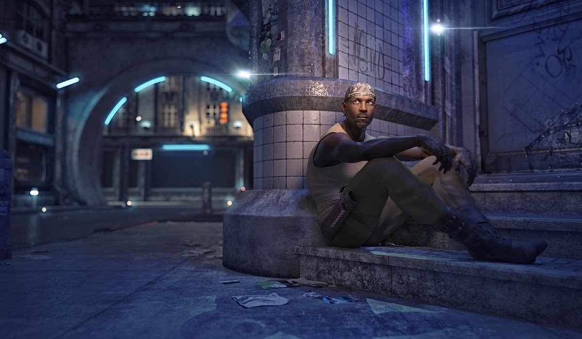
The Visual Grammar of Speculative Worlds
When you pick up a graphic novel set in a distant galaxy or a magical realm, the artwork isn't decoration. It's the primary vehicle for world-building. As a reviewer, your first task is to assess how the visuals establish the rules of the speculative world. Look at the architecture, the clothing, the lighting, the colour palettes. Do they feel coherent? Does the artist use visual motifs to signal technology, magic, or alien cultures? For instance, a cyberpunk story might rely on neon-drenched rain and cramped, vertical cityscapes, whilst a high fantasy epic might use sprawling, hand-painted landscapes to convey scale. Ask yourself: could you understand the setting without any captions? If yes, the artwork is doing its job.
Judging the Artwork: Craft, Consistency, and World-Building
Beyond world-building, you need to evaluate the technical execution. Is the line work clear or intentionally chaotic? Does the colouring support the mood, or does it fight it? Consistency matters enormously in speculative fiction because readers need to trust the visual rules. If a character's magical aura changes colour between panels without explanation, that's a flaw. Similarly, check character designs: can you tell protagonists apart in a crowd scene? Are expressions readable? A good reviewer notes whether the art serves the story or merely showcases the artist's skill. Specificity helps: instead of "the art is beautiful", write "the artist uses thick, inky shadows to suggest moral ambiguity, and the muted earth tones make the alien desert feel oppressive."
Panel Pacing and Narrative Rhythm
Panel pacing is the invisible architecture of a graphic novel. It controls how fast you read, where you linger, and when you feel a jolt. In speculative stories, pacing often mirrors the genre: a space battle might use many small, tight panels to create frantic energy, whilst a mystical revelation might be given a single, full-page splash to let the image resonate. As you review, note the rhythm. Does the artist use silent panels to build tension? Are there repetitive layouts that feel lazy, or inventive grids that enhance the theme? For example, a time-travel narrative might use overlapping panels to show simultaneous events. Pay attention to gutters—the spaces between panels. Do they imply swift transitions or slow, contemplative gaps? Your analysis should explain how pacing affects your reading experience.
Dialogue, Captions, and the Weight of Words
In a graphic novel, words and images share the narrative burden. When reviewing dialogue, ask: does it sound natural for the setting? Speculative fiction often requires invented slang, formal speech patterns, or alien languages. Clunky exposition is a common pitfall—characters telling each other things they already know. Good dialogue reveals character and advances plot without feeling like a lecture. Captions, too, need scrutiny. Are they used for internal monologue, historical context, or omniscient narration? A common flaw is over-captioning: explaining what the image already shows. The best graphic novels let images carry the emotional weight, using dialogue only for what cannot be seen. Note any moments where a single line of dialogue recontextualises an entire panel—that's expert storytelling.
When Images Do the Heavy Lifting
The most powerful speculative graphic novels trust their visuals to convey complex ideas. A character's grief might be shown through a decaying landscape; a political allegory through the design of a city. As a reviewer, you should highlight specific panels where the image alone tells the story. For instance, a silent sequence showing a robot discovering a flower can say more about consciousness than pages of dialogue. Look for visual symbolism: repeated objects, colour shifts, or changes in art style that signal a shift in reality. Ask yourself: if you removed all the text, would the narrative still make sense? If yes, the artwork is carrying its weight. If no, the graphic novel may be relying too heavily on words, which is a valid critique.
A Practical Framework for Your Review
When you sit down to write your review, structure your assessment around four pillars. Use the following checklist to keep your analysis focused and specific:
- Artwork: Comment on line, colour, composition, and consistency. Does the visual style suit the speculative premise?
- Pacing: Describe the panel rhythm. Where does the story speed up or slow down? Are gutters used effectively?
- Dialogue: Quote a line that works and one that doesn't. Does speech reveal character or just deliver information?
- Visual narrative: Identify moments where images alone advance the plot or theme. How much weight do they carry?
Start with a brief summary of the speculative premise, but keep it short. Then dedicate a paragraph to each pillar, using specific examples from the book. Avoid vague praise; instead, describe a panel layout or quote a line of dialogue. Consider the target audience: is this for fans of hard sci-fi, epic fantasy, or weird fiction? Mention how the graphic novel compares to others in its subgenre. Finally, give a clear recommendation: who will love this, and who might struggle? Your warm, expert voice should guide readers, not dictate. Remember, a good review is a conversation, not a verdict.


Coding is used in almost all aspects of life and work now, be it directly or indirectly. It’s not just for companies in the tech sector. “An increasing number of businesses rely on computer code,
Coding is used in almost all aspects of life and work now, be it directly or indirectly. It’s not just for companies in the tech sector. “An increasing number of businesses rely on computer code,
Coding is used in almost all aspects of life and work now, be it directly or indirectly. It’s not just for companies in the tech sector. “An increasing number of businesses rely on computer code,